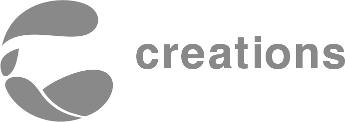
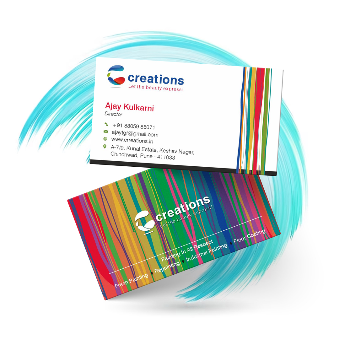
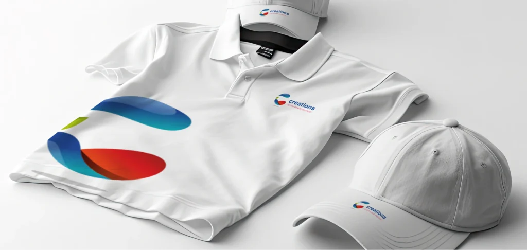
The logo concept centers around the letter ‘C’ of the business name, artistically transformed into a circular shape to signify completeness. Its symbolism encompasses a globe, embodying our holistic approach to providing 360-degree services in the construction and real estate sector. Royal blue for a corporate feel, red to highlight key elements.
At the core offerings lie services such as painting, renovations, alterations, and structural work.
The logo evokes a strong sense of corporate sophistication.
The Best Part is
Client had given a Free Hand to work on a creative way...
The Challenge
Integrate ‘C’ into a complete logo, balance red & blue theme, and showcase expansion.
The Approach
Circular ‘C’ for business name, symbolizing global reach & 360-degree services.
The Best Part is
Client had given a Free Hand to work on a creative way...
The Challenge
Integrate ‘C’ into a complete logo, balance red & blue theme, and showcase expansion from paint and renovation to all future constructive services.
The Approach
Circular ‘C’ for business name, symbolizing global reach & 360-degree services.
Royal blue for a corporate feel,
red to highlight key elements.